Human-Powered Fitness
A workout app powered by people, not presets.
Mobile app
B2C
Fitness
📘 Overview
This was a mobile app for serious, goal-driven fitness users. But unlike typical workout apps, it wasn’t about templates - it was about human connection. Real coaches uploaded new workouts every week. Real voices guided you in real time. And when you were working out, others saw it. They could cheer. They could high-five. It felt alive.
Our goal was to design a platform that could:
Motivate people without guilt or pressure
Make training programs feel fresh, not recycled
Encourage consistency through real-time energy
Services
Product Design, UX Strategy, Interaction Design
Client name
Undisclosed Fitness Startup
Team
Vahan Kirakosyan, Lead Product Designer
Alex Rivera, Product Manager
Lena Cho, Head of Content
3 Coaches
1 Researcher
🧑🤝🧑 Users & Audience
Primary Users were:
People training from the gym, at home or on-the-go
Users seeking flexible yet structured workout programs
Fitness fans craving accountability without 1:1 coaching
Secondary Users:
Beginners looking to ease into strength training with support
Community-focused people who enjoy peer momentum
🎯 The Challenge
"Most fitness apps feel cold, repetitive, or way too generic."
We heard this a lot. Users were tired of scrolling endless programs, only to be met with boring plans and no feedback. What they wanted was a sense of presence - someone there with them, guiding, encouraging, pushing.
Our challenge was to design a system that:
Let coaches upload new content every week
Delivered workouts with real-time voiceovers
Allowed users to log effort and weights without breaking flow
Created a social layer without becoming another feed
🧠 My Role & Team
My Role: As Lead Product Designer, I defined the product direction, mapped out the end-to-end experience, and led design execution across multiple stages. I collaborated closely with stakeholders and product leadership to balance coaching philosophy with usability.
Team Collaboration:
I owned the UX strategy, interaction flows, and core product decisions
Collaborated with a coaching team that provided weekly training content
Worked alongside researchers and copywriters to align tone, pace, and structure
🔍 Research & Insights
We spoke to fitness enthusiasts, new members, personal trainers, and users of competing apps like Nike Training Club and Centr. What stood out:
People love progress, but they need context
"Just tell me what to do today" came up constantly
Logging reps needs to feel like part of the workout, not homework
Audio makes or breaks trust — tone matters
This shaped our key experience pillars: clarity, guidance, connection.
✍️ Design Artifacts
We began with whiteboards and user flows focused on:
Workout navigation and journal views
How and when users log weights and reps
Placement and timing of audio prompts
We iterated through multiple versions of intensity sliders, daily calendars, and coach-to-user communication models.
Visual clarity and minimal interruptions were critical.
Before moving into high-fidelity, we also spent time refining core interactions in low-fidelity wireframes.
These early layouts helped us map the real workout experience — not just the screens.
We focused on:
The flow between browsing programs and starting a session
How users log intensity without breaking workout rhythm
Integrating live cheering without feeling distracting
Keeping navigation minimal during active workouts
Working in low-fidelity let us catch friction points early — and stay focused on experience first, visuals second.

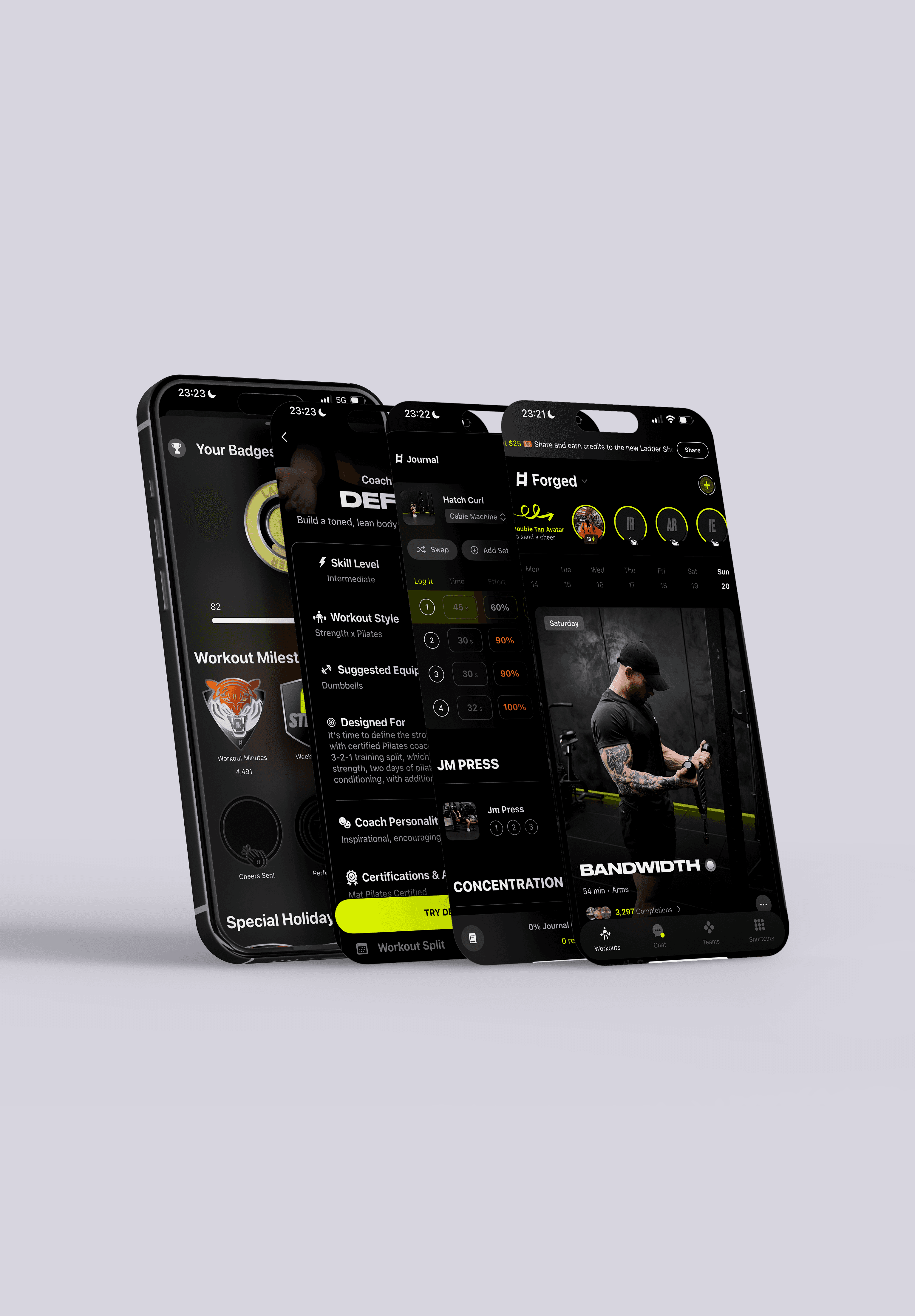
🎨 Hi-Fidelity & Design System
Once the core interactions felt right, we moved into high-fidelity execution.
The focus was on creating an interface that felt intense, alive, and clear - without overwhelming users in the middle of a workout.
We built a system where:
Dark backgrounds kept users locked into their session
Accent colors surfaced milestones and progress moments
Typography stayed bold and direct, minimizing cognitive load
Microinteractions added energy without adding friction
Every design decision served one goal:
Keep users moving - physically and digitally.
The final UI tied together coaching, logging, cheering, and community with one consistent visual language.
📝 Case Study Summary
This project was about more than tracking workouts. It was about designing motivation, momentum, and connection into an experience people actually want to return to. With a deeply human approach to fitness, this app blended real coaching, community energy, and adaptive structure to help users stay consistent — without feeling robotic or generic.
As a Lead Product Designer, I led the entire design process from user research and flow mapping to UI, prototyping, and final delivery. This case study walks through how we built a truly social and flexible workout platform from the ground up.
✅ Outcome
The experience was warmly received. New users reported higher satisfaction in weeks 1–2 compared to benchmarked fitness apps. Community engagement grew 3x over baseline. People reported feeling more connected and more consistent.
🔁 Reflection
Designing for fitness is never just about reps. It’s about rhythm, voice, presence, and pace. This project pushed me to think like a coach, not just a designer - and reminded me that people don’t need more content. They need more connection.
Selected work
[2022 -2025]